Let’s speak of skeuomorphism today. Interaction design foundation puts the definition lucid if you aren’t familiar with this concept before.
Skeuomorphism is a term most often used in graphical user interface design to describe interface objects that mimic their real-world counterparts in how they appear and/or how the user can interact with them. A well-known example is the recycle bin icon used for discarding files. Skeuomorphism makes interface objects familiar to users by using concepts they recognize.
Skeuomorphism is related to what ecological psychologist James Gibson termed “affordances.” Affordances refer to action possibilities of objects or other features of the environment. The most commonly cited examples of affordances include door handles and push buttons; their physical designs inform users that they can be rotated or pushed. Skeuomorphism represents affordances in digital user interfaces. It fits with our natural interpretation of objects—but in a digital world.
Skeuomorphism’s use in making interfaces more familiar and thus easier to use stems from the early days of computing and mobile computing. For instance, early versions of Apple’s mobile operating system, iOS, used skeuomorphism heavily across its user interface (e.g., buttons resembling glossy ‘real’ buttons, photos with white borders looking like physical photographs, etc.). Skeuomorphism in iOS was widely regarded as part of the reason it was so intuitive to use by people who had never used a touch-based smartphone before.
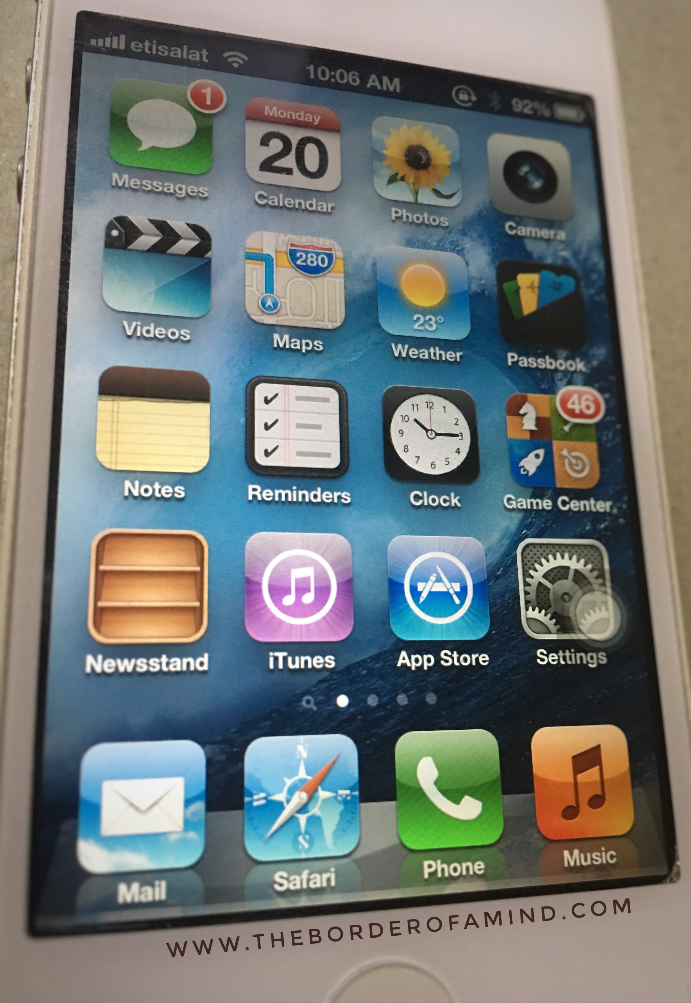
I use an old iPhone 4 running iOS6 on dual boot as a second phone for nostalgic reasons with skeuomorphic design in all its glory!
I truly believe Skeuomorphism should come back to modern web and mobile app interfaces. Simply put, this design methodology uses objects in software interfaces (buttons, graphics, etc) that closely resembles their real-world counterpart. You’d easily recollect the “trash can” icon, which is probably the easiest skeuomorphic object recognizable in modern interfaces. From the 1980s, it was predominantly used by Apple across their product interfaces and Steve Jobs was an ardent fan of it. From around 2007, this design method was on a downhill and was replaced by the flat designs that became trendy in tech. Approaching 2020, I really wish Skeuomorphism would renew itself on a modern context across all platforms for the better. There are some hopeful developments.